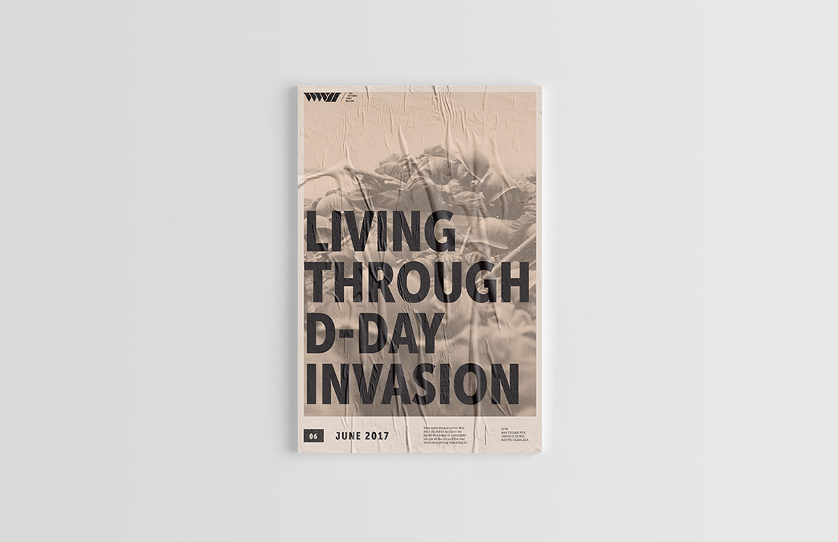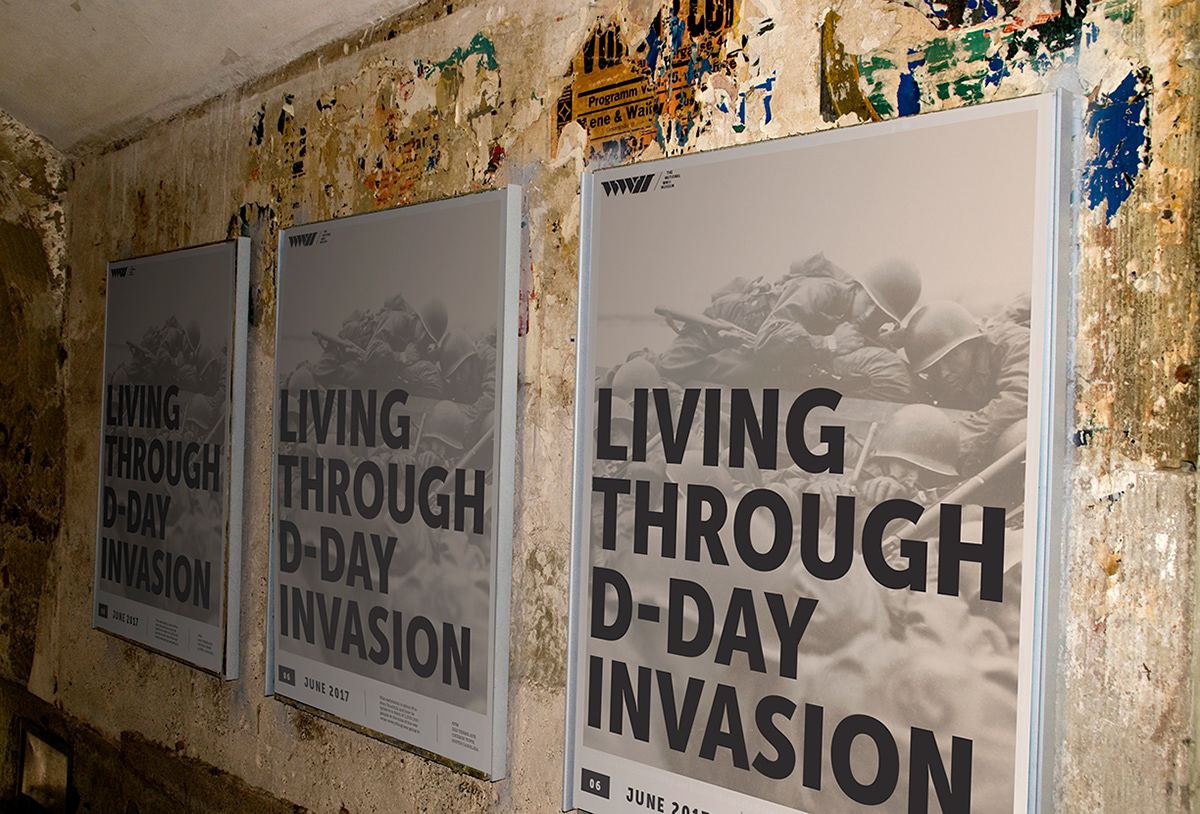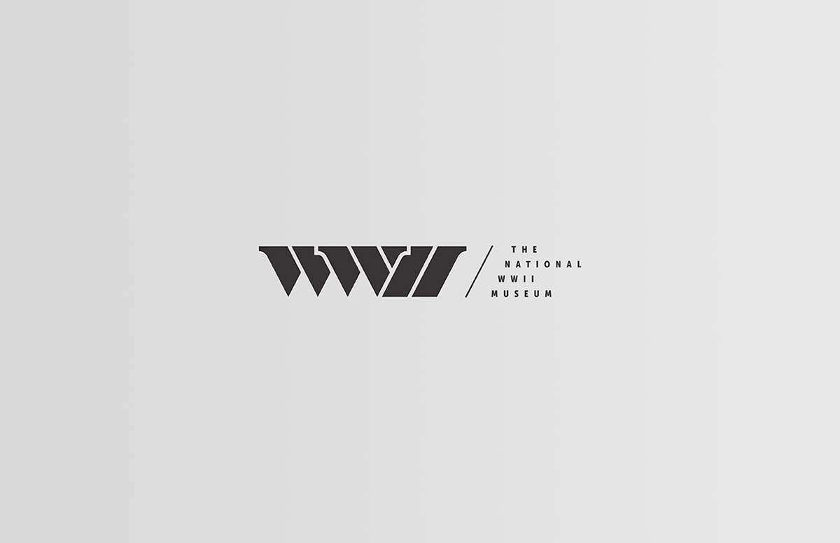
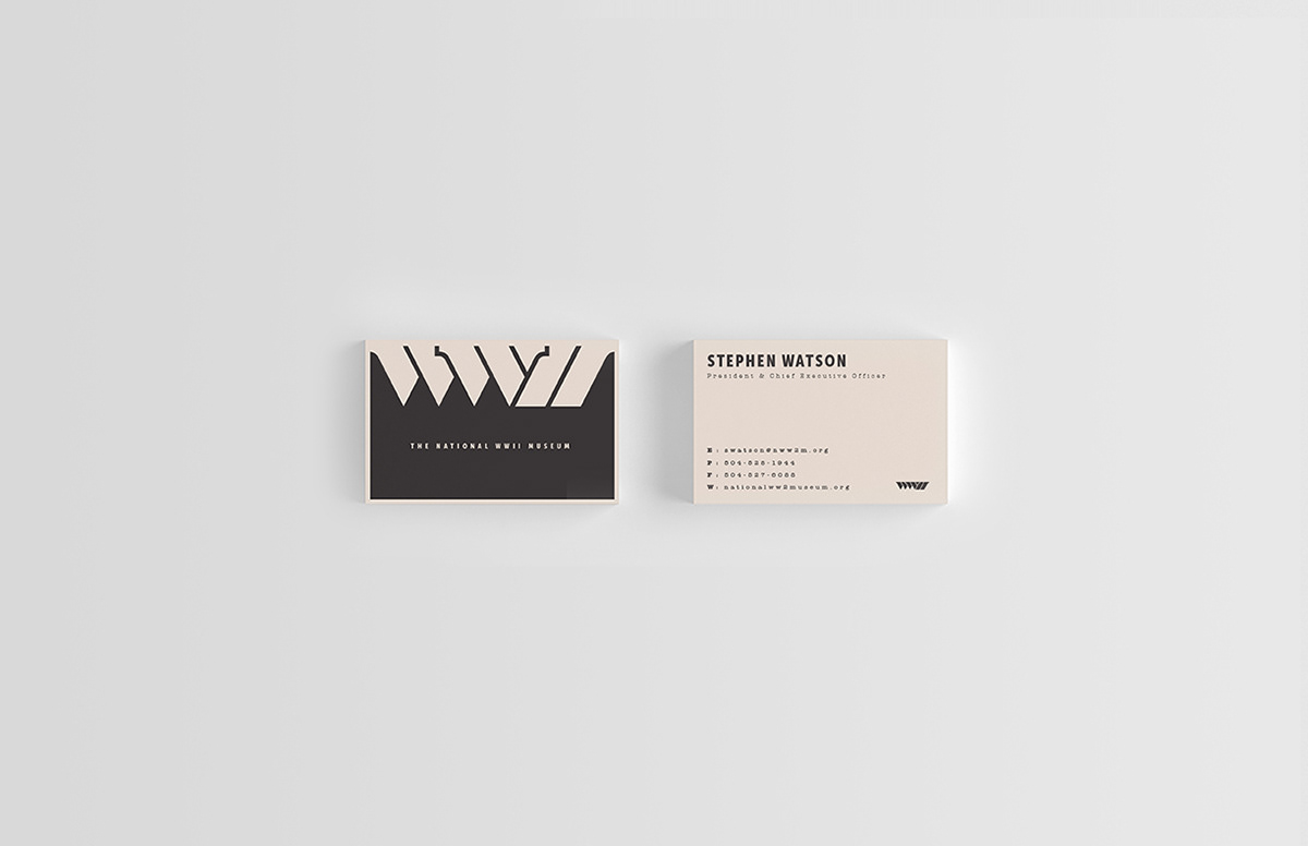
When creating a direction for the museum’s brand, the widely used abbreviation and roman numeral combination WWII is the most iconic direction. Also, a conceptual take on this word mark would focus more on the core values found deep within this museum, making it a more unique mark to the museum itself. The heavy solid shape of the simple WWII wordmark gave it a bold form, representing courage and strength. Within the mark one can see freedom in the wing-like serifs, sacrifice in the sharp lines, and unity within the corresponding forms and angles.
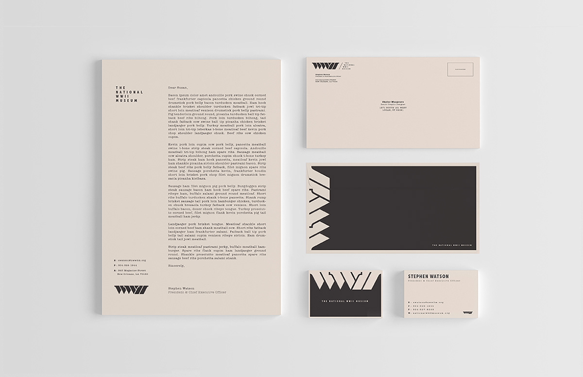
The wordmark itself is not the only contributing factor to why this branding direction is effective and unique. The high-contrasting color palette provides the perfect amount of contrast to compete with surrounding competitive materials and branding. The era-driven typeface and practical design cues create a brand experience that is not only reminiscent of the museums focused era, but also appropriate within current branding of similar museums.
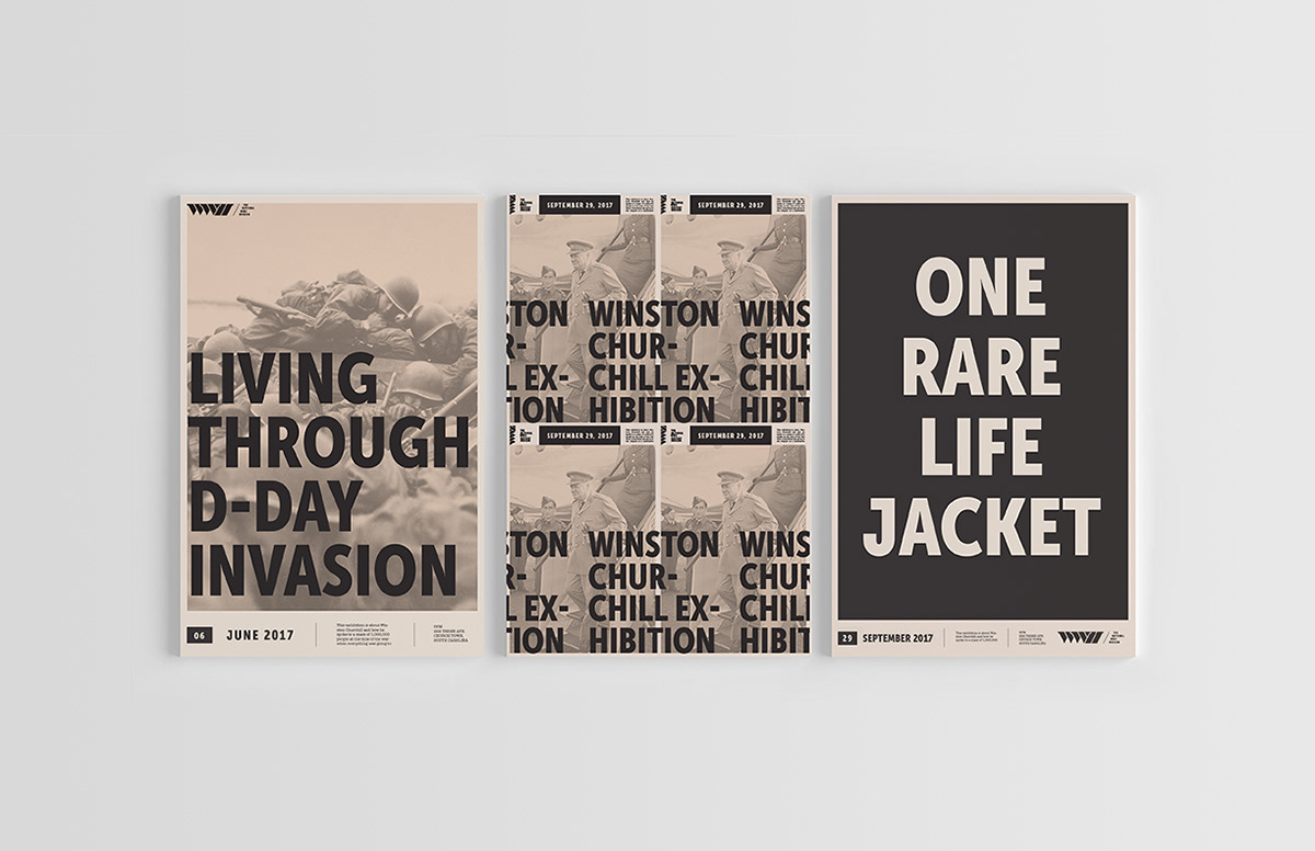
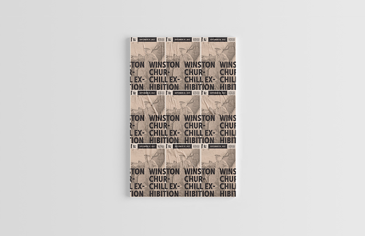
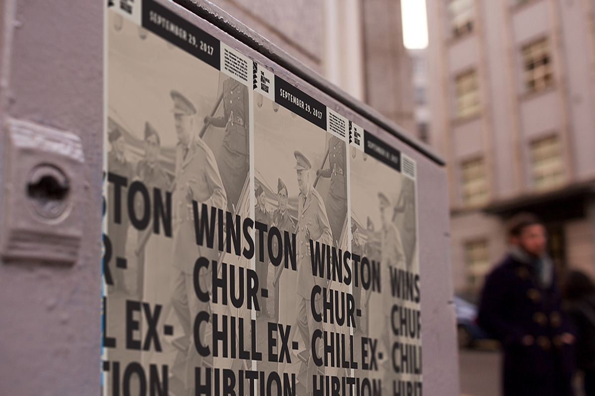
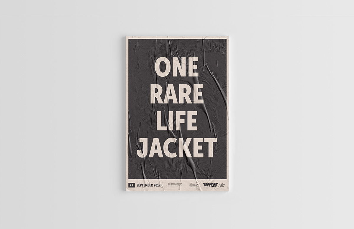
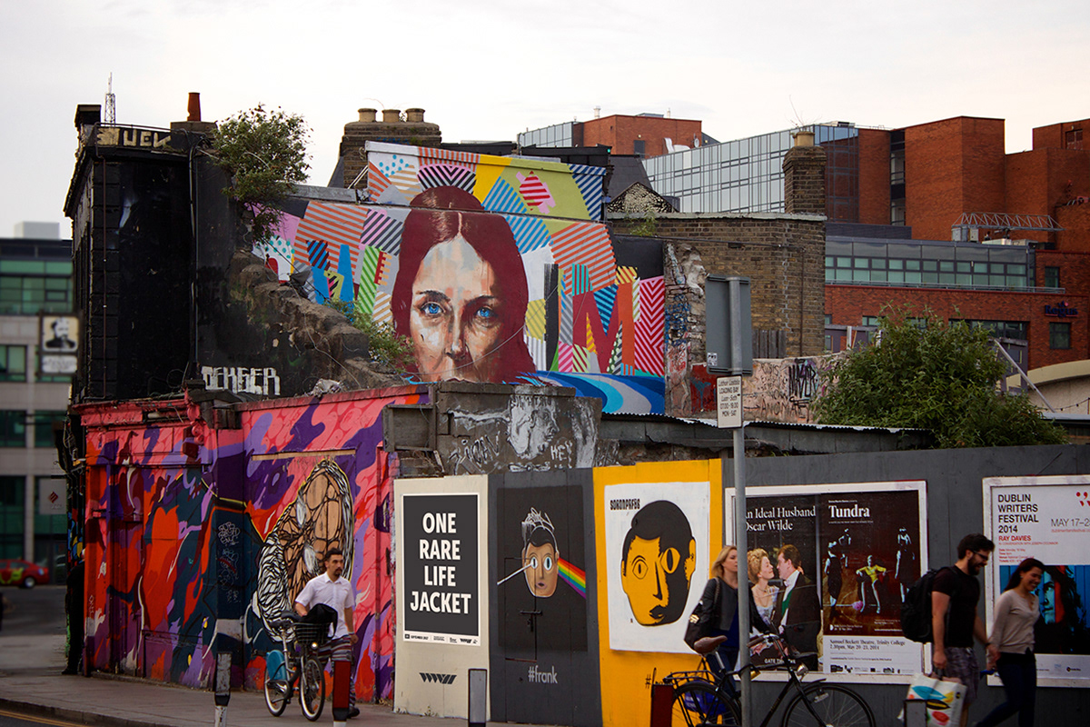
In a more practical sense, the mark and branding direction creates a utilitarian experience reminiscent of the 1940’s war era, while still showing the beautiful contemporary side of the museum’s structure and exhibitions. This combination of past-utilitarian and modern-contemporary creates an attraction to both the young and the old key demographics. This combination also creates a system that is competitive and unique to the surrounding museums within the United States.